Theme development
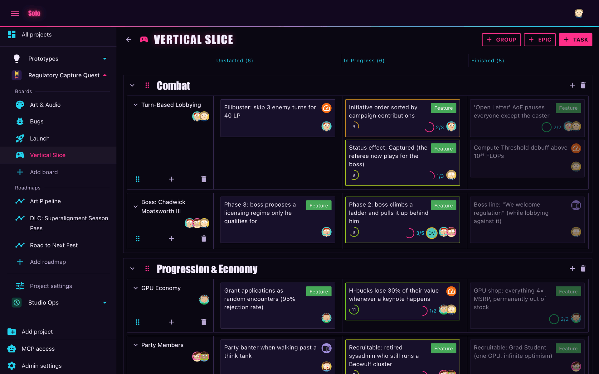
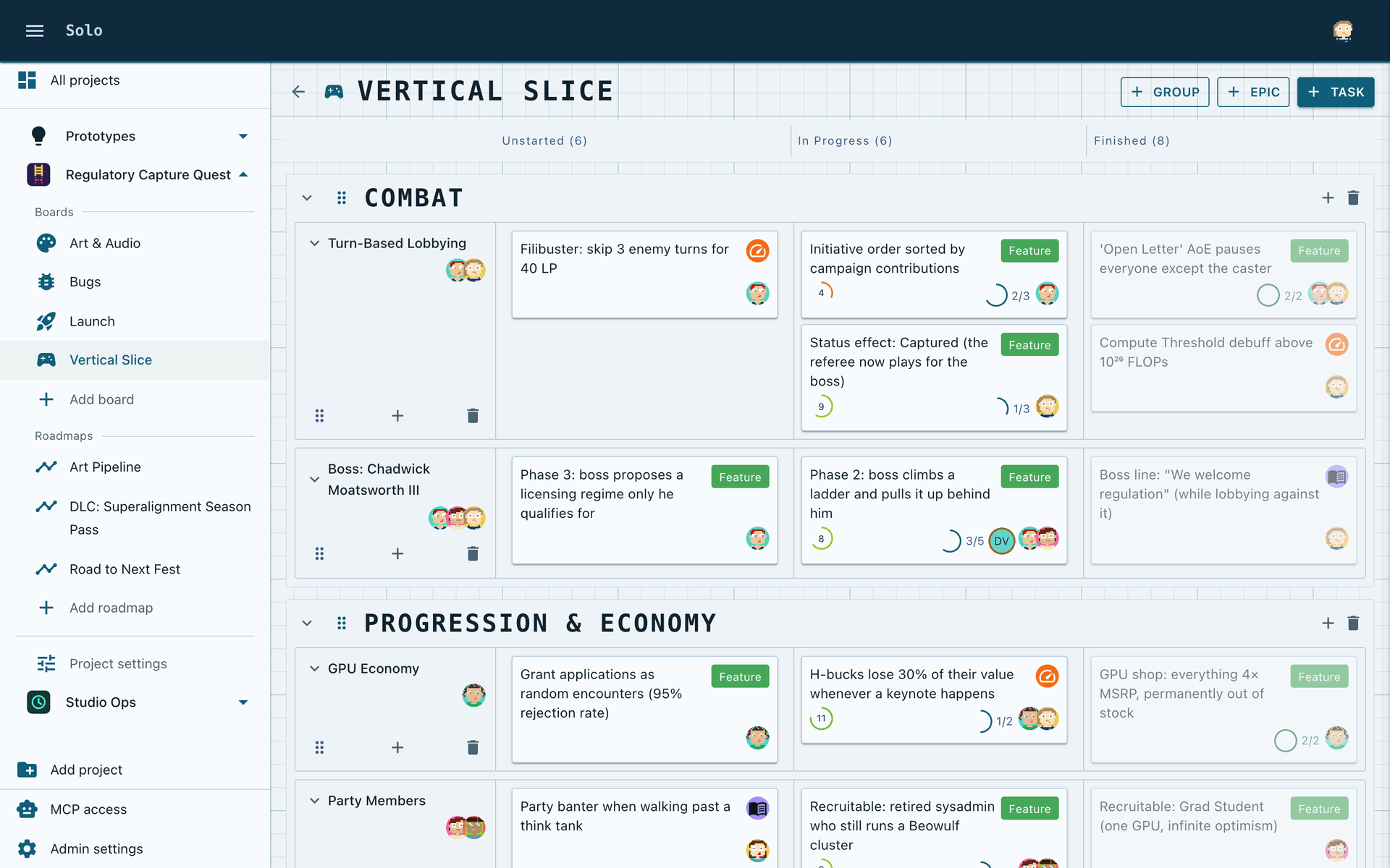
A theme sets the colours, fonts, layout sizes and sign-in screen of a Solo instance. Make one from a built-in theme, then package and install it.
What a theme controls
A theme is a .zip file with a manifest, theme.json, and optional files. It controls:
- The palette of the dark scheme and of the light scheme.
- The fonts, the font sizes and the font weights.
- Three layout sizes: the corner radius, the height of the app bar and the width of the sidebar.
- The background and the logo of the sign-in screen, in the web app and in the desktop app.
- A stylesheet, for details that the manifest cannot set.
A theme contains no code.
Two settings decide what a person sees:
| Setting | Who selects it | Where Solo stores it |
|---|---|---|
| The theme | A super admin, for the full instance | In the database |
| Light or dark | Each person | In the browser of that person |
Solo has three built-in themes: Ahlquist Interactive, Arcade and Blueprint. Ahlquist Interactive is the default.
Make your first theme
1. Copy a built-in theme
The built-in themes are folders in the repository, in the same format as a package: src/Solo.Api/Themes.
Copy one folder, for example blueprint, and give the copy a new name.
my-theme/
├── theme.json
└── content/
    ├── theme.css
    ├── login-dark.svg
    └── login-light.svg
2. Change the ID and the name
Open theme.json and change these fields:
{
  "formatVersion": 1,
  "id": "my-theme",
  "name": "My Theme",
  "description": "One line about the theme.",
  "author": "Your name"
}
Two themes on one instance cannot have the same id. Use lower-case letters, digits and -.
3. Change the palette
theme.json has two palettes, dark and light. Start with a small number of colours:
"dark": {
  "primary": "#58c7e8",
  "background": "#071019",
  "surface": "#0e1c2a",
  "textPrimary": "#dbe9f2",
  "textSecondary": "#90a9bd"
}
Each field that you omit keeps a default value. A theme with a small number of colours still gives a complete result. Reference lists all fields.
Supply the two palettes. If a theme has only one, the other scheme uses the default colours of the UI library.
4. Make the package
Make a .zip file with theme.json at its root:
cd my-theme
zip -r ../my-theme.zip .
5. Install the package
- Copy
my-theme.zipinto the themes directory of the instance. - Open the Admin settings.
- Select the rescan button in the Theme card.
- Select your theme.
- Load the page again.
No restart is necessary. Install a theme has the details.
6. Change and repeat
After each change, make the .zip file again, copy it, rescan, and load the page again.
Solo adds a hash of the package to the address of each theme file. A changed file gets a new address, so the browser does not show an old copy.
If Solo refuses the package, the Theme card gives the file and the reason. The instance continues to use the themes that it loaded before.
Package layout
my-theme.zip
├── theme.json          required, at the root
└── content/            all other files
    ├── theme.css
    ├── login.jpg
    ├── login-light.jpg
    └── fonts/
        └── my-font.woff2
File types
A package can contain theme.json and files of these types in content/:
.css, .png, .jpg, .jpeg, .webp, .gif, .svg, .woff, .woff2, .ttf, .otf
File names
File and folder names can contain letters, digits, ., _ and -. Do not use spaces. Solo puts the names in addresses and in generated CSS.
Limits
| Limit | Value |
|---|---|
Size of the .zip file |
12 MB |
| Size of one file | 12 MB |
| Total size after extraction | 48 MB |
| Number of files | 200 |
Check the contrast
A palette can look correct to you and be hard to read for a different person. Solo tests its built-in themes against these WCAG AA contrast ratios, in the two schemes:
| Pair | Minimum ratio |
|---|---|
Text on background, surface and backgroundGray |
4.5 : 1 |
| Sidebar text on the sidebar background | 4.5 : 1 |
| Accent colours, app bar text and sidebar icons on their background | 3 : 1 |
| Labels on filled buttons and chips | 4.5 : 1 |
Check your own palette against the same ratios.
Do not set the *ContrastText fields, such as primaryContrastText. When you omit them, Solo calculates a readable text colour for each filled control.
Next
- theme.json reference: each field of the manifest.
- Fonts and stylesheet: add font files and custom CSS.